Communicate Data Intuitively with the Latest Grapher Release
There are several new features in the latest release of Grapher! From the new Graph Gallery and Plot Previews features, to connect existing worksheets to new data sources; the latest Grapher release provides new, easier ways to work with your plots and data.
If you’re curious about how these new features can improve your workflow, download the Grapher Free Trial and test them out today! To learn more about the features, continue reading.
“Our goal with the latest iteration of Grapher is to improve the overall user experience through redesigned functions and a more intuitive interface.”
Santiago Vivas, Grapher Product Manager
Graph Gallery
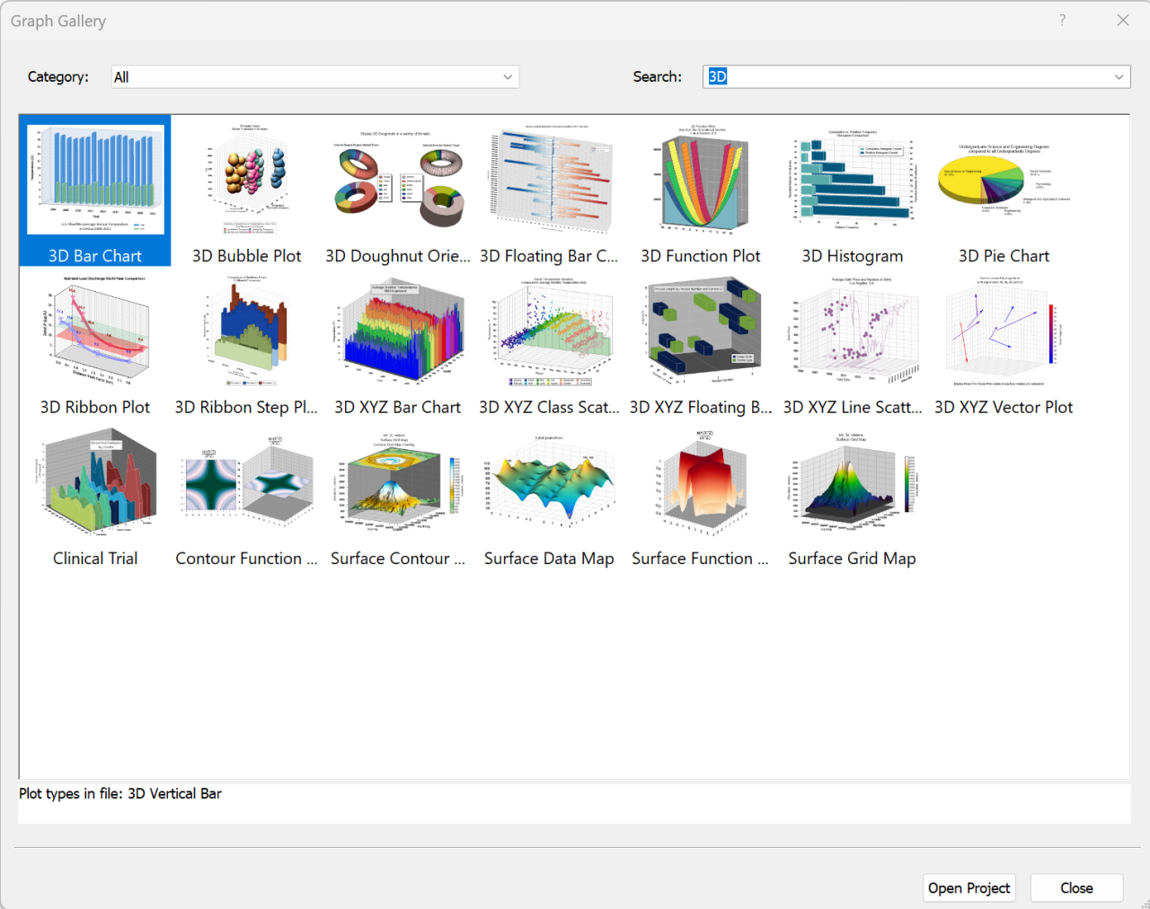
Grapher is first and foremost a visual communication tool. Which is why we wanted to provide users with data selection options that remove the need to navigate a long list of file names. The new Graph Gallery allows users to search and filter compact views of plots without opening the full projects files.
You can even use the Graph Gallery to build custom sample galleries from your own projects! Those galleries can act as templates for future projects, or a new way to share your work with colleagues.
Plot & Print Previews
Plot previews are now available for Grapher in Windows Explorer. Turn on the Preview pane in Windows Explorer to see previews of your GRF, GPJ and GRT files.
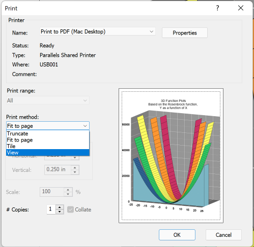
Print previews are also now available. See exactly what you’ll print, before you print it! A new “View” print method also lets you print only what is displayed on the screen; handy for printing specific, zoomed-in portions of a plot.
Thinned Plots
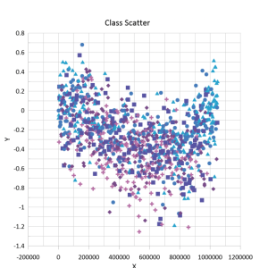
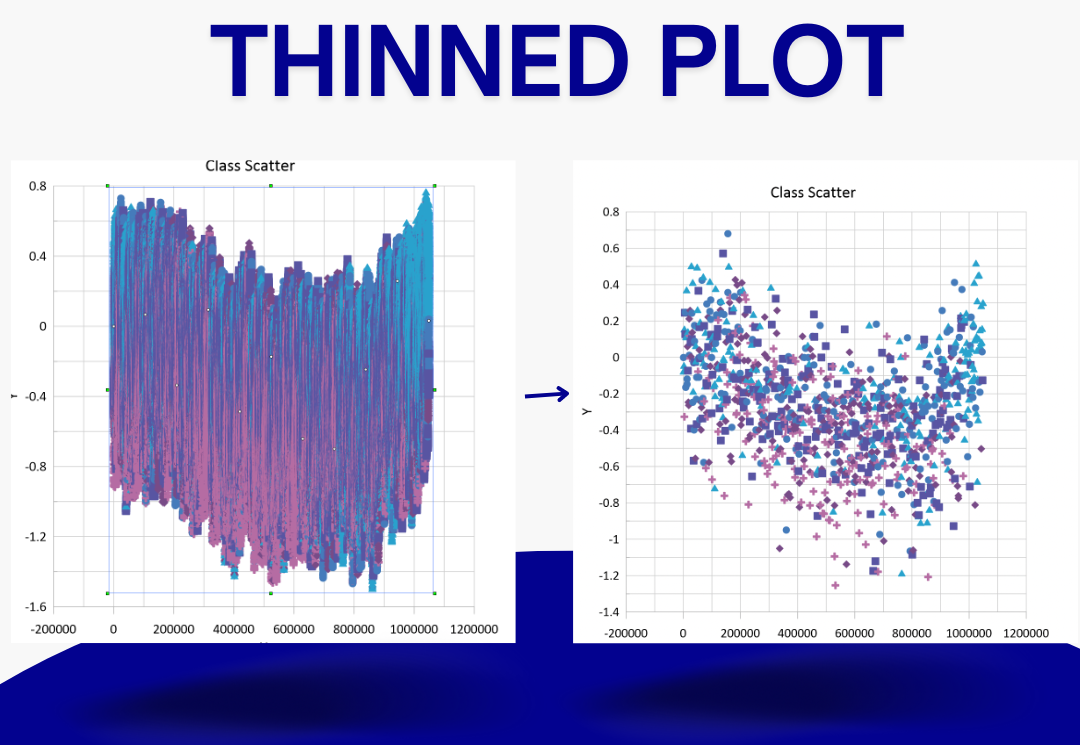
Customizing the design of a plot can take a lot of time when working with large datasets. The new Thinned Plot command lets you reduce, or “thin” the data shown in a plot; dramatically reducing the amount of time spent editing, formatting, moving and resizing the plot. Once you’ve added the customizations that help you tell the story of your data, turn off Thinned Plot and the plot will be re-drawn with the full set of data.
Remap Worksheets
We know you will often work with different datasets that are in the same format. The new “Remap Worksheets” command allows users to navigate to new/update data sources and assign them to an existing worksheet. When a new file is linked all associated objects (plots, axis, text, etc.) are automatically updated using the new data.
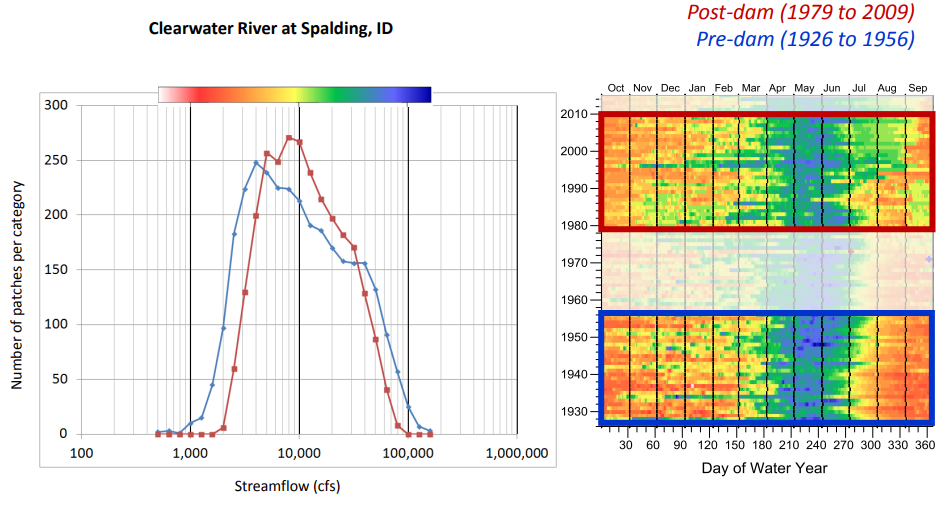
For example, if you are a hydrologist analyzing streamflow data you can easily remap your formatting to a new time period; saving yourself time.
General Improvements
Home tab optimization
Grapher’s Home tab was getting a little messy so we’ve cleaned things up a bit. The ‘Add to Graph’ section has also been removed since same tools are already available under Graph Tools.
Graph type groupings
The graph types have been put into more sensible groups. You can now also quickly select recently used plots.
Graph Wizard improvements
It’s now much easier to browse and select the data source and to preview the selected plot type before it is generated.
All these features are available right now FOR FREE in Grapher for any user with an active subscription license or active maintenance. Simply click File | Online | Check for update and you too can start impressing clients with intuitive plots.
If you do not have an active subscription or maintenance license download the Grapher Free Trial and see if Grapher is the visualization tool you’ve been looking for.
