Building a Sustainable Future: How Hydrogeologists Communicate Water Quality
Water is one of the most precious resources on this planet, and the responsibility to keep that resource usable for future generations can feel hefty. A scientist’s job involves more than just monitoring and recognizing the warning signs that water quality may be degrading. You also need to communicate that information effectively to decision makers.
Piper (Trilinear) Diagram
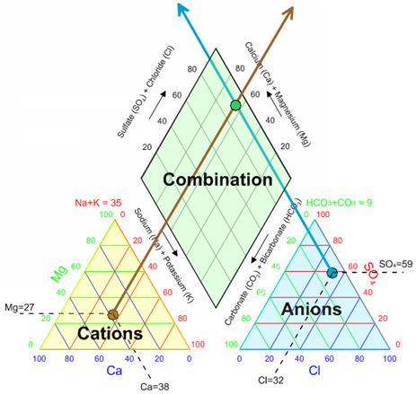
A Piper (Trilinear) diagram is one of the most widely used graphical representations in hydrogeology to display the chemical composition of water from a particular aquifer.
The diagram consists of two triangle ternary diagrams and a diamond plot in the middle. The lower left triangle represents the relative proportion of major cations (such as calcium, magnesium, and sodium) and the lower right triangle represents major anions (such as bicarbonate, sulfate, and chloride) in the water sample. The diamond plot in the center of the diagram then is a projected, normalized summary of both triangles identifying the relative percentages of the ions.
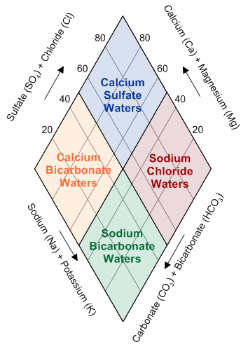
By analyzing the diamond plot hydrogeologists can categorize water samples into hydrochemical facies. A hydrochemical or groundwater facies is a group of water samples that share similar chemical characteristics based on the concentration and types of dissolved ions present in the water sample. The diagram below demonstrates 4 common facies and where they would fall on the diamond plot.
Durov Diagram
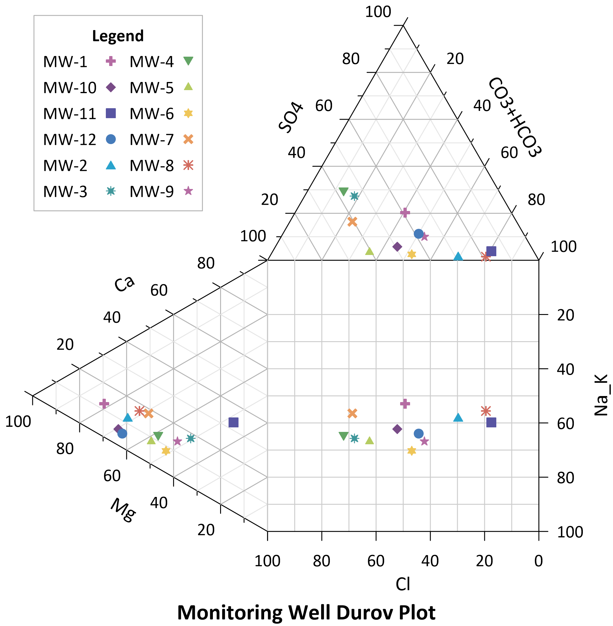
The Durov diagram is quite similar to the Piper diagram as it is used to chart the chemistry of water samples and reveal relationships among sample groups. A Durov diagram demonstrates the relative concentration of 6 ion groups with two ternary plots. The ternary plot on the left represents the cations. The ternary plot on the top represents the anions. The square plot is a projection of the cation and anion ternary plots.
The Durov diagram is used to compare multiple water samples instead of just classifying one. By examining which samples are grouped closely together in the projection square you can infer which samples have similar chemical compositions and strengthen the classification of samples into facies.
This diagram is powerful when looking at multiple aquifers in a region to identify shared characteristics. By identifying those shared characteristics you can predict environmental factors such as the path of water flow, the source of contamination, or if contaminants are spreading.
Extended Durov Diagram
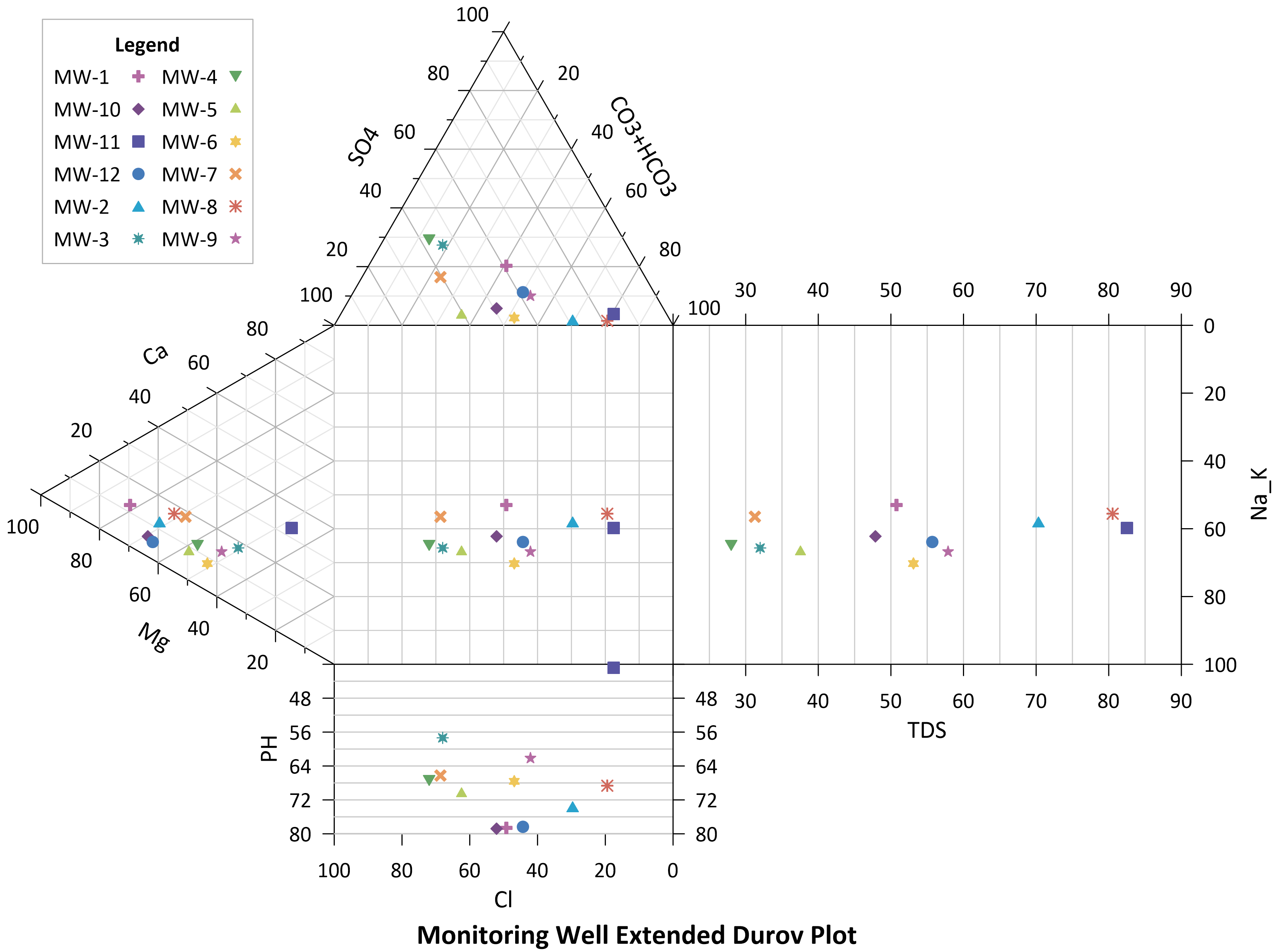
An Extended Durov diagram incorporates a pH and TDS (Total dissolved solids) plot onto the original Durov plot. The pH plot is extended below the projection square and the TDS plot to the right. The Extended Durov serves the same purpose as the original, to group similar samples. With the additional parameters you can perform further geochemical analysis related to the acidity, type, and concentration of solids within a group.
Stiff Diagram
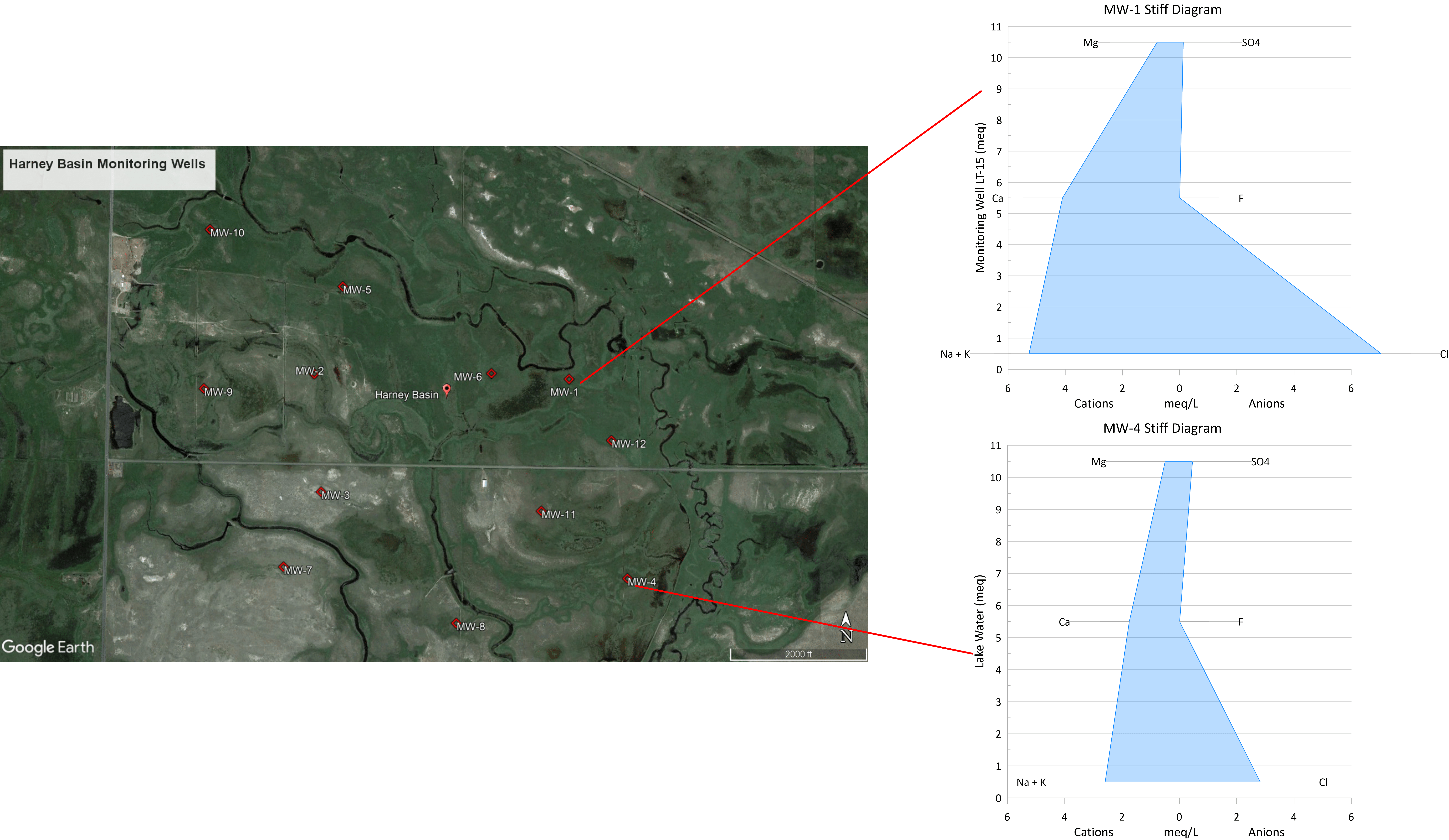
A Stiff diagram is a unique way to visually represent the ionic composition of a single water sample. The values of the cations and anions for a water sample are recorded and plotted in milliequivalents per liter. The left side of the diagram shows the cation concentrations and the right side shows the anion concentrations.
The farther a point is from the center, along the X axis, the larger the ionic concentration. To create the polygonal shape the Stiff diagram is known for the individual ionic points are connected. The relative size of the plot is an indication of the total dissolved solids concentration.
It is common practice to create a stiff diagram for several samples of interest and view them all at once to make a quick visual comparison of the group. Combining a Stiff diagram with aerial imagery can be an effective presentation method if your samples are close geographically. Clearly demonstrating to decision holders where wells with higher ionic concentrations are located and why this may be a warning sign of a larger problem.
By utilizing one or all of these visualization methods you can monitor changes in an aquifer over time and create a hydrogeological report that resonates with decision makers better than stating statistics ever will.
Grapher is a program developed by scientists, for scientists that offers all of these specialized plots. Grapher also features 80+ other plot types and supports dozens of file formats to help you translate your data and advocate for remediation. The work you do protects the planet’s water, we want to help.
Build a sustainable future and communicate water quality data with Grapher. Download the free trial today
