Boost Your Data’s Impact with Superior Color Mapping Techniques
Imagine transforming a sea of numbers and charts into a captivating visual story that grabs your audience’s attention and keeps them engaged. That’s the power of effective color mapping in data visualization. The right colors don’t just make your work look good—they make your data meaningful, accessible, and enjoyable for your stakeholders. By mastering color mapping, you can turn complex data into clear, intuitive narratives that speak to all audiences. Let’s dive into how you can elevate your data presentations with the perfect color palette.
The Power of Color in Data Visualization
Color mapping is more than just a visual enhancement; it’s a tool that enables data interpretation by the human brain. Our brains can pick up simple trends in a small dataset without much help, but we require some sort of illustration to understand large collections of data.
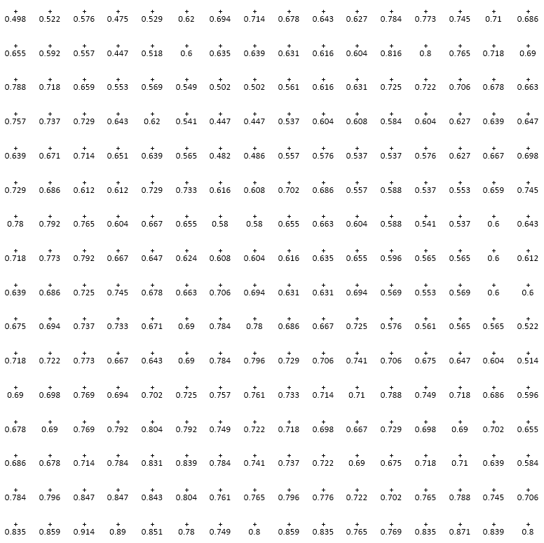

Left: A small selection of pixels with their numeric color value. Right: The full image resulting from those pixels.
For example, the left image above shows the numeric color values for a selection of pixels making up an image and on the right you see the visual representation of all of the pixels in the image. Can you identify which portion of the image is represented by the numeric values? Certainly not without a lot of effort!
Understanding how to use color effectively is crucial for anyone creating, presenting, or interpreting data visualizations.
Key Considerations
When selecting or designing a color map for your data the most important factor to consider is the perceptual accuracy, or the accuracy with which the human eye can perceive the results. A color map with high perceptual accuracy will highlight trends, emphasize critical data points, and make complex datasets accessible to a broader audience. Conversely, a color map with poor perceptual accuracy can obscure important information, insert false highlights, and mislead viewers.
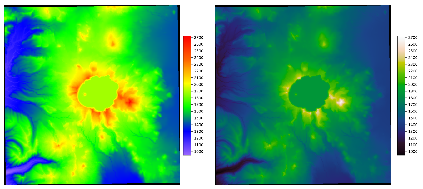
Left: Color relief map of Crater Lake using the default Rainbow color map resulting in an apparent large shelf surrounding the crater.
Right: Color relief map of Crater Lake using the Vridis sequential color map resulting in a more gradual and accurate representation of the terrain.
The next thing to consider is the type, scale, and distribution of the data you’re presenting. For example, if you’re working with concentration data, you may want to insert a visual jump in values at a cutoff concentration. Alternatively, if you’re working with linearly distributed elevation data, you would be better served by a sequential color scheme with no visible jumps in color value.
Other key considerations include whether certain color palettes are commonly associated with the data you’re presenting, how the colors you choose will be perceived by those with color blindness, and what the results will look like when printed in black and white.
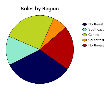
Pie chart created using a qualitative colormap
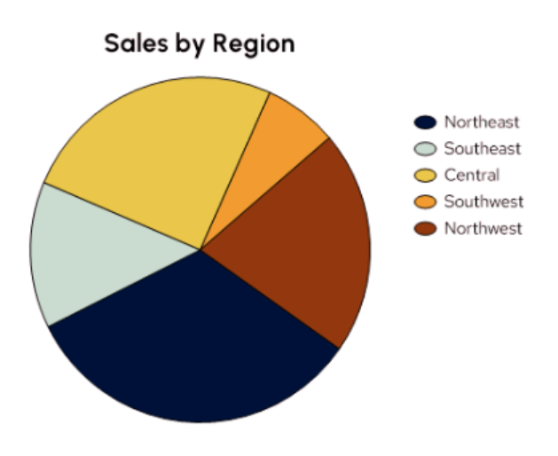
Pie chart with deuteranomaly color blindness simulation
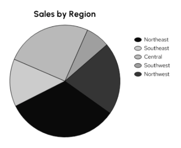
Pie chart as seen in black & white print
Color Mapping Best Practices
1. Choose a color map that aligns with your data
How is your data distributed? Is there a cutoff or central value around which the data divides? Answering these questions will help you determine the type of colormap that best suits your data. The most common types of color maps and associated data to consider are:
- Sequential: Sequential Data progresses from low to high such as temperature, elevation, or concentration. Similarly, sequential color maps use variations in lightness and saturation of color to emulate a progression from low to high.
- Diverging: Diverging color maps are used when there is a need to highlight deviations from a central point, often zero. They employ two contrasting colors that meet at a neutral midpoint, which helps identify values above or below a specific threshold. Examples of diverging data include velocity, slope, and profitability.
- Qualitative: Qualitative color maps are best suited for categorical data or data grouped into numeric or text-based classes such as well type, contaminant, or zone. These schemes are most useful in visualizations like pie charts, bar charts, or thematic maps.
2. Consider Color Perception
Human perception of color can vary based on many factors, including cultural differences and color vision deficiencies. It’s essential to use universally distinguishable color combinations. For example, the illustration of water depth using blues, greens, and sometimes yellows or purples is common around the globe. Using similar color maps to illustrate water data makes the data immediately recognizable to a broad audience.
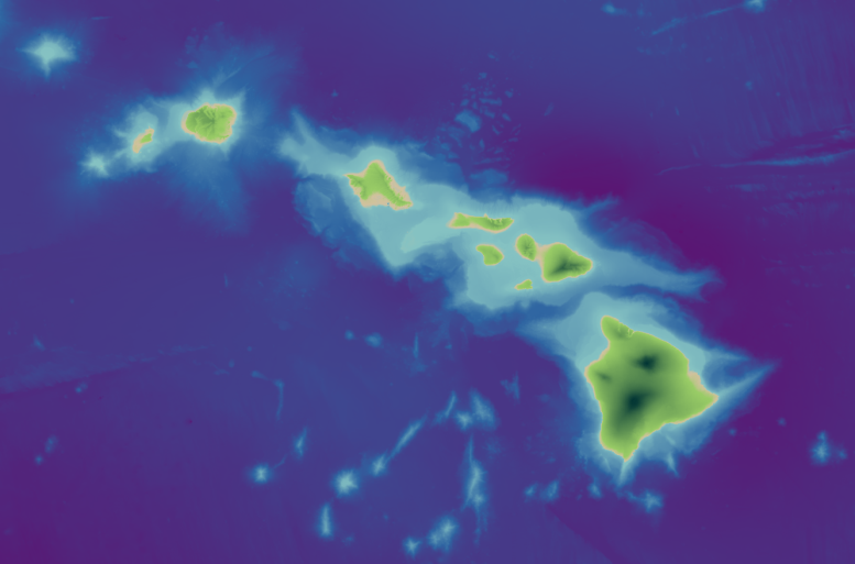
Diverging colormap in greens and blues applied to a color relief map of the Hawaiian islands
If you are not color blind it can be difficult to understand how a visualization will look to someone that is. Luckily, tools like color blindness simulators can help ensure your visualizations are accessible to everyone.
3. Keep it Simple
Simplicity is the key to effective color mapping. Overcomplicating your color scheme with too many colors can confuse the viewer. Use a limited color palette and avoid unnecessary embellishments. A clear, straightforward color scheme will make your data more accessible and easier to understand.
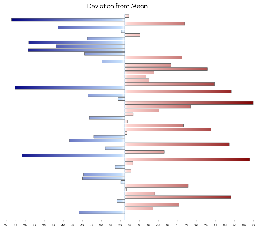
Diverging colormap in reds and blues showing the deviation from mean as a floating bar chart in Grapher
4. Be Consistent
Don’t get caught thinking lots of colorful images will captivate your audience. When presenting numerous charts and maps of related data, using the same color map to represent the same types of data makes it easier for the audience to quickly interpret results. Quick visual interpretation ensures your audience stays engaged throughout a presentation or article instead of getting lost trying to understand one or two images.
Effective color mapping is a fundamental aspect of data visualization that can significantly enhance the communication of complex information. By aligning your color map with your data, considering color perception, keeping it simple, and being consistent, you can create visualizations that are both informative and visually appealing.
Ready to apply these principles in Surfer & Grapher? Check out the resources below.
References
Thyng, K. (2015, July). Perceptual Color Maps in matplotlib for Oceanography [Conference Presentation]. Scientific Computing With Python. https://www.youtube.com/watch?v=XjHzLUnHeM0
Smith, N., & Van der Walt, S. (2015, July). A Better Default Colormap for Matplotlib [Conference Presentation]. Scientific Computing With Python. https://www.youtube.com/watch?v=xAoljeRJ3lU
